A reorder policy is a decision under uncertainty.
Most tools treat it as a calculation against a single forecast. SoPlenty treats it as an optimization across the uncertainty itself — 100 scenarios of demand, evaluated inside the same loop that produces the policy. For planners who want to see the shape of the risk, not a single recommended number.
Most companies aren't at the trade-off. They're inside it.
The inventory–fill rate frontier shows what's achievable: the lowest inventory required for a given fill rate, and the highest fill rate achievable from a given inventory. Most companies aren't on this curve. They're inside it — holding more inventory than they need, achieving less fill rate than that inventory could deliver, or both.
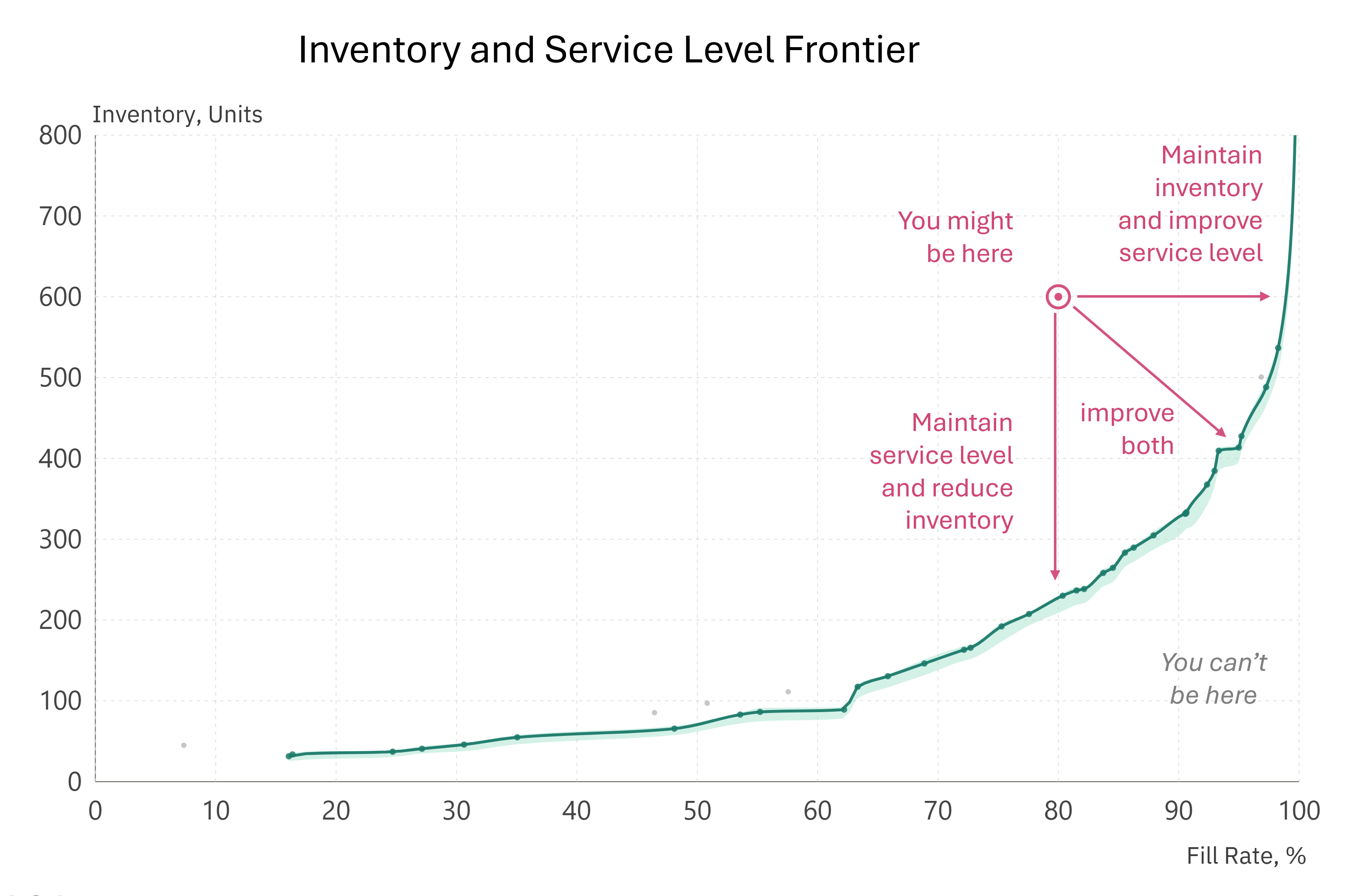
Each point on the curve is one SoPlenty run with one min-max replenishment policy (reorder and fill-to points); the smooth shape emerges from iterating. Your bounds pick which point. The math makes the shape visible.
Six objectives. No dollar value on a stockout.
Conventional optimization requires a price on a stockout — a number nobody really agrees on. Estimates differ by 10× between sales and operations. Putting it in the optimization doesn't resolve the disagreement; it hides it.
SoPlenty doesn't ask you to. You set six bounds, in the units you already think with:
- Fill rate: a minimum you must hit, and an excellent level you'd ideally hit.
- Inventory: an excellent level you'd ideally stay below, and a maximum you can't exceed.
- Number of orders: an excellent number you'd ideally stay below, and a maximum limit.
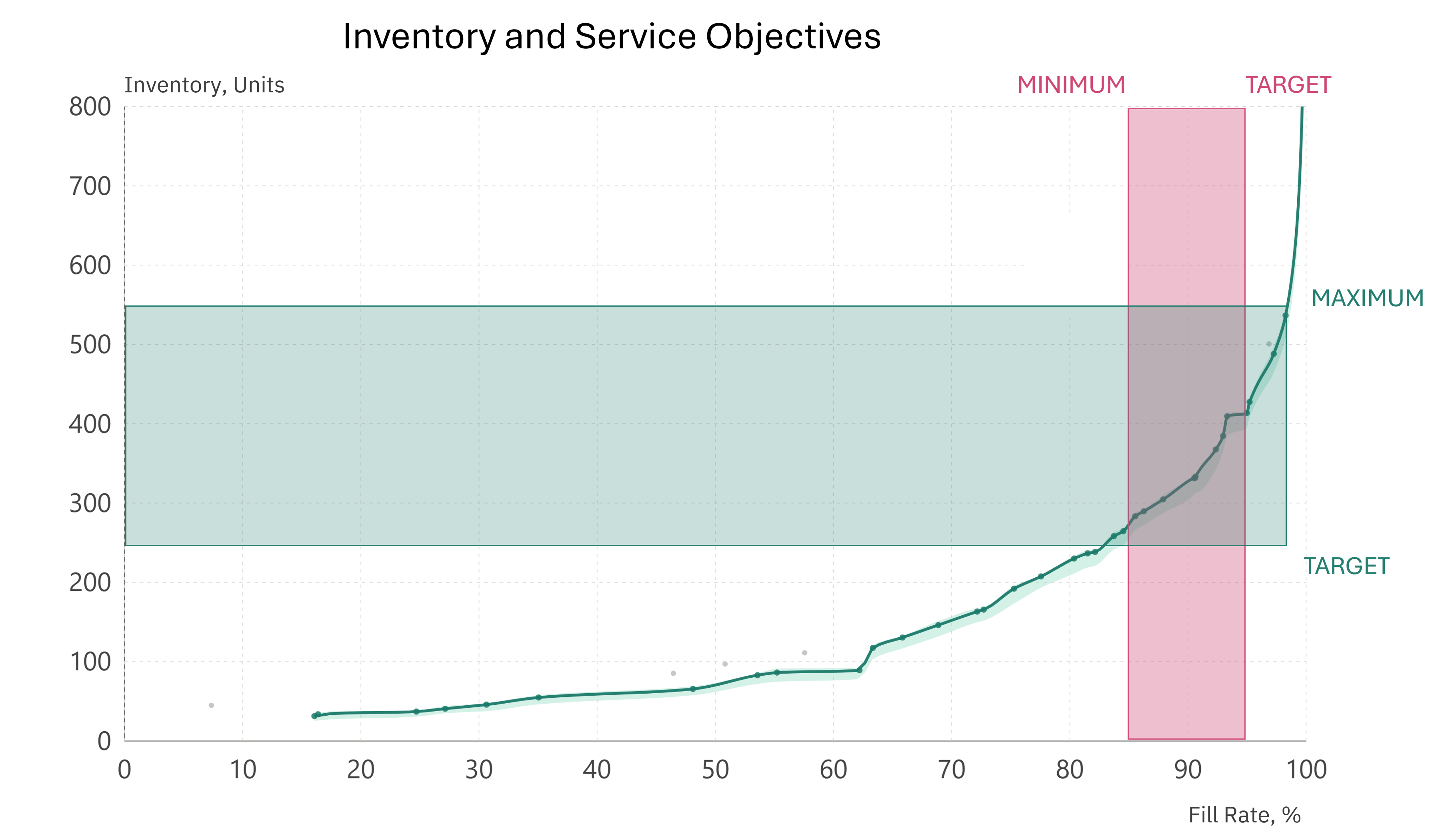
The optimizer finds policies that satisfy all objectives. If none can, it shows you which needs to be adjusted — so the conversation about which to relax becomes explicit, not buried in a cost number.
From your spreadsheet to a policy in seconds.
Upload
Demand history, items with lead-times and targets. Plus starting on-hand stock and supply. A total of 2-4 CSV files.
Classify and forecast
Smooth and seasonal items use conventional time-series. Intermittent items get a two-part model: one part predicts occurrence (does demand happen in this period?); the other predicts magnitude (if it does, how much?). This is what lets SoPlenty forecast intermittent items at weekly cadence - versus the tendency to smooth demand by aggregating monthly.
Why a continuous distribution and not a normal?
The magnitude distribution is gamma-shaped: zero-bound, right-skewed, with variance that scales with the mean. Real demand sizes have these properties — they can't go negative, they have long upper tails, and their variance scales with the mean. Normal distributions miss all three.
Model selection
Each forecast produces three things: occurrence, magnitude, and uncertainty around both. Single-number metrics reward only the second, and only on the average. SoPlenty scores models on accuracy in all three. A model accurate about the mean but wrong about the spread will under- or over-buffer.
How each dimension is measured
- Occurrence uses Brier Score, which rewards calibrated probability estimates of yes/no events.
- Magnitude uses MASE (Mean Absolute Scaled Error), which scales error against a naive baseline so items of different volumes are compared on the same footing.
- Uncertainty uses CRPS (Continuous Ranked Probability Score), which rewards forecasts whose entire distribution matches what occurred. CRPS reduces to mean absolute error in the limit of a perfectly confident forecast.
Scenarios and optimization
SoPlenty samples 100 demand trajectories from the per-period distributions. For each candidate (min-max) policy, it simulates inventory dynamics across all 100 — computing the fill rate and inventory distributions the policy produces. A policy that's great on the median scenario but disastrous in the 20th percentile is rejected.
Output
The policy has a reorder point and a fill-to level per item per week, plus the relative probability for fill rate and inventory outcomes, plus the most likely results from the simulations.
What the likelihood curves mean.
The output most unfamiliar to planners coming from traditional tools is the likelihood curve. Same data, three forms:
Each dot is one of 100 scenario outcomes. Bin them, you get the histogram. Smooth it, you get the curve — a continuous picture of where the fill rate is likely to land. The P10/P90 markers show the spread between the 10th and 90th percentiles. A policy with 88% to 97% is more reliable than the same median with 82% to 98%. The green band shows your bounded target zone.
In the dashboard, you see this for both fill rate and inventory, plus the underlying forecast and policy over time:
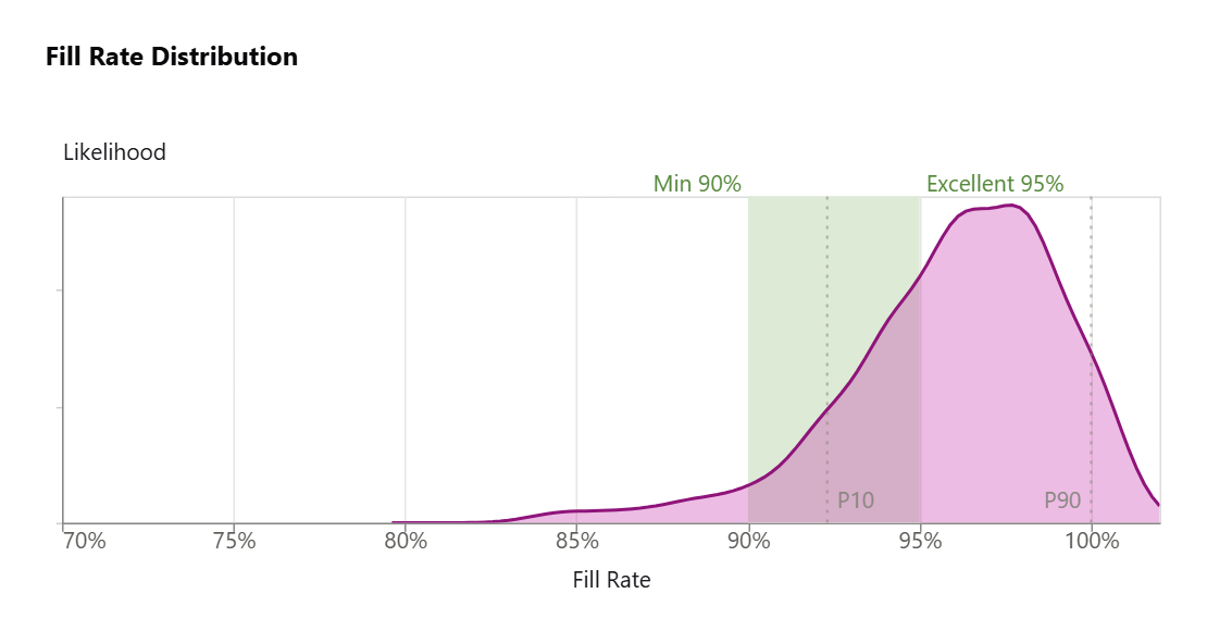
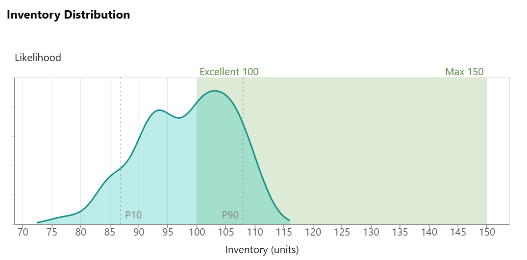
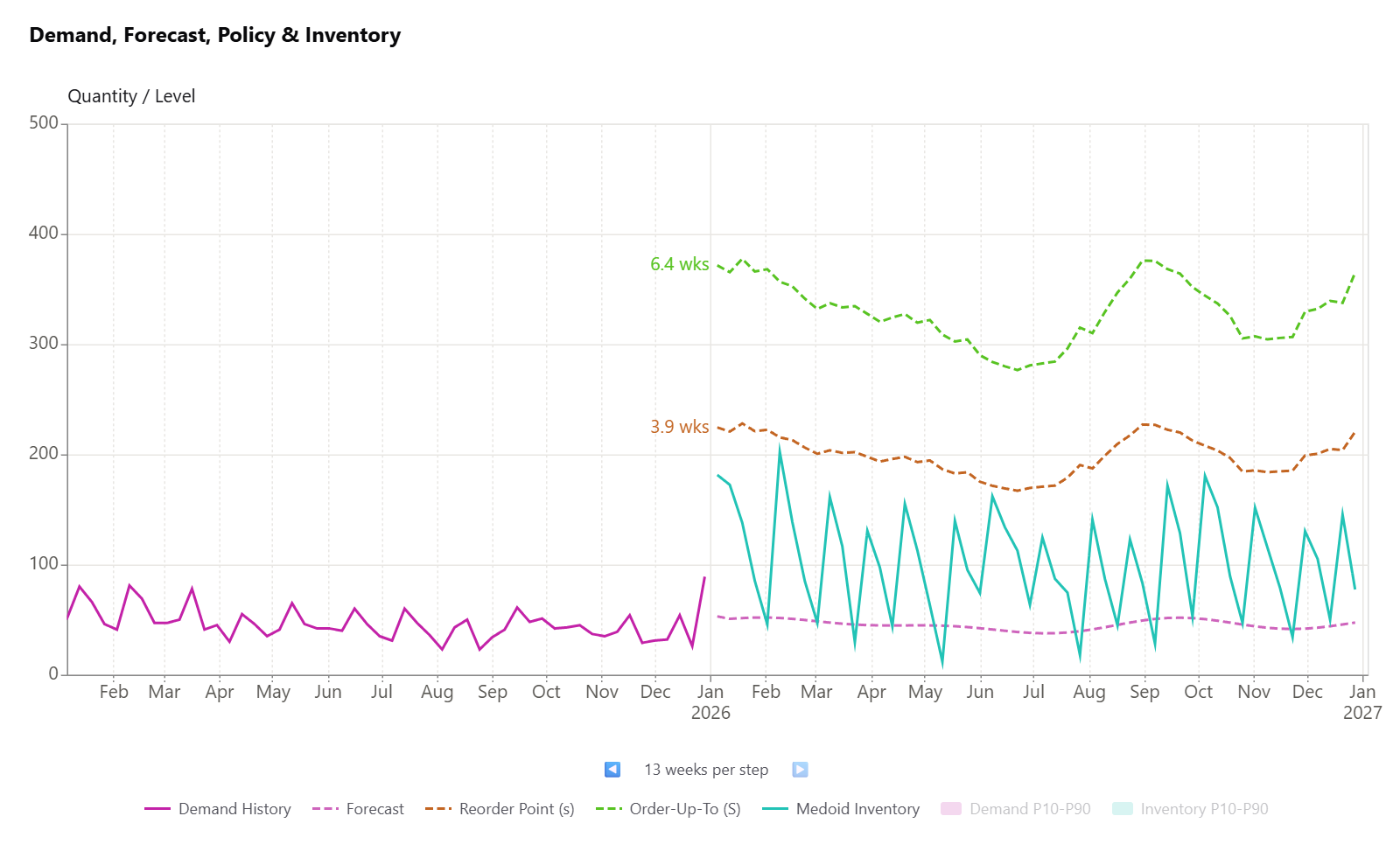
The math doesn't replace the decision. It makes it visible. When no policy satisfies all objectives, SoPlenty tells you which is binding — and the conversation about which to widen is where the business decision lives.
Three months free. The full engine on your data.
In the alpha:
- Probabilistic forecasting at weekly cadence, including intermittent items.
- Multi-objective stochastic optimization producing (min-max) policies per item per week.
- 52-week visibility; likelihood curves for fill rate and inventory with P10/P90.
- Web dashboard with CSV input/outputs. Fully private account with database-level isolation.
Not in the alpha: Excel Add-In, ERP integration, multi-user features. You help us test core features with real data first; everything else follows.
Terms
- We would like your honest and open feedback about SoPlenty. The alpha test will last approximately two months.
- After the alpha test, we would like to offer you three months of free access, a $750 value.
- One-to-one support and fast turnaround on all your questions - it is important to us that you get good results.
- Confidentiality. Your data is yours, isolated at the database level. Swap out item IDs and use a privacy factor if required.
Request alpha access
Drop your email and we'll be in touch with an onboarding process. We're admitting alpha participants in small batches.